
Product Case Study
A Human-Centered Expense Management App
Infor’s mobile expense management product (XM) wasn’t meeting customer expectations; it had been designed to offer businesses extreme configurability, but in doing so it confounded their employees with complexity. Squeezing it into mobile had just made the experience worse.
The existing XM app was a native shell around a JSP web client. Directly porting the web UI and workflow just rendered frustratingly complex forms, using the app relied on preexisting knowledge of the tool. It was unreliable and clunky, the camera would often incorrectly crop receipt images, and the app didn’t provide feedback to assure the user that their work had been saved.The design never considered the actual context of most mobile XM users: tracking expenses while out of the office on business travel.
This case study describes how my team set out to reenvision the mobile experience and rebuild the technology stack to deliver an expense-capture and reporting application that would significantly improve the experience for frequent travelers.
Product Definition
Qualitative User Research
The product team began by partnering with a “lead-adopter” customer, a global business consulting firm, to establish a target audience for the product: traveling consultants who file their own expenses (they’re not senior enough to have their own support staff). Need-finding workshops with these target users helped the design team define personas and prioritize use cases.
Further in-depth interviews with this cohort helped identify functional gaps and experience issues with the current web and mobile tools. Our subjects shared their work context and goals, which we used to refine personas and focus on a common use case to orient our design process. With this foundation in place, we iterated alongside our partners to plot a development and implementation roadmap.
As we created prototypes, a beta application, and then a robustly functioning app, we returned again and again to the same set of users and stakeholders to test usability of specific designs and prioritize capabilities for both client-side app code and the API connecting it to Infor’s legacy XM platform.

Prioritized Functionality
For the first release of the redesigned XM mobile experience, we focused on three core features which we prototyped before beginning API and app development:

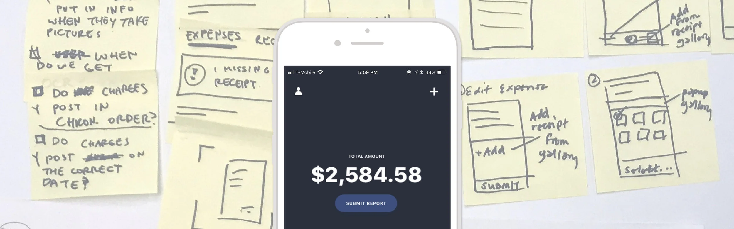
Lightweight receipt capture & simple expense creation: No one likes to hold on to receipts for an extended period of time, but the existing version of XM Mobile wouldn’t allow the user to attach their receipt until after they had created an expense. Saving a new expense required details they didn’t have at the time of the transaction.
We flipped this flow, so users could snap a picture of their receipt at transaction time and fill in the expense details later. (More on this below.) Our app only required the user to enter minimal information to save an expense without submitting it. By incorporating feedback dialogues into the flow, we helped assure our users that they could toss their paper receipts.
Offline-first functionality: We’ve all been traveling in places where we didn’t have cellular data service — be that a foreign country or an airport jetway with poor signal. With this reality in mind, we set out to build the app to seamlessly store everything locally, and send data to the server piecemeal without interrupting the user flow. The design would communicate the status of various expenses with clear labels, so the user never had to wonder whether there was an error or if the app was simply waiting for a connection.
“Inbox-zero” experience: Our users saw expense tracking as a nagging chore. The new XM experience is designed feel like striking items off a to-do-list. Submitting a report would be as simple as selecting relevant expenses, titling it, and sending it off for approval.
Product Experience
Privileging Users Over Data Objects
We redesigned the app flow around the human in the interaction (rather than the data object). The mobile context was a key differentiator that enabled us to take a different approach compared with the legacy web app. Present at the time of transaction, onboard device data is attached to the receipt without additional by the user.
Instead of starting with an expense report, populating line-items and then adding receipts as attachments, we began the expense reporting flow with just the receipt (at or close to transaction time). An expense report is then built up through lightweight aggregation: corporate card expenses arrive via data feed and are easily matched to receipts. Expense attributes are groomed over a series of in-context moments rather than as a longer chore at the end of a business trip. With this approach we hoped to replace retroactive tracking and paper receipt saving.

1. Capture receipts with app camera & categorize
2. Match receipts to expenses
3. Bundle expenses into a report
Automating the User Flow
As the product team refined this experience, I was especially proud that their solution would afford future automation powered by machine learning. In a flow designed around aggregation, each human interaction represents an interpretable choice that can train a clustering algorithm. Privileging the user’s time and context, the product ends up designing those actions out of the system altogether.
1. ML applies expense category derived from user history & onboard data
2. ML matches receipts to corporate card transactions
3. ML bundles expenses into report via clustering algorithm
Iterating on XM’s Look & Feel
In the first working version of the app, our UI design was sterile. While designers on the team liked this minimal aesthetic, our customers and internal stakeholders saw it as unfinished. I worked with the team to define specific dimensions where the look and feel could markedly change to better deliver on Infor’s promise of “consumer-grade” enterprise applications.
For example, we began evolving how we used color throughout the app. We had started with a color strategy where color was used to signal next actions and object status. Thinking about consumer applications, we shifted our strategy to increase the saturation and coverage of color in the interface. That led us to use color to guide attention rather than specific actions.
The team tested UI designs with our customers’ employees. Our bright, electric colors drew strong reactions — some liked it, others really did not. That feedback helped steer us towards a more staid, mature palette.

Reactions to XM Mobile
Throughout the design and development process we continued to survey our customer’s employees. We gauged both comprehension and interest our new user experience. Sharing this data with our platform partners and customers conveyed how the new app would be received by users. These insights guided our pilot roll-out and helped the group structure a change-management program.
My Contribution
I led the mobile product team — product management, design, and research — responsible for all aspects of the new XM app. I also managed our customer-partner relationship and orchestrated long-term planning with the platform team as part of a strategic initiative to refine Infor’s mobile and API strategy.
My responsibilities also included coordination of go-live operations (security and pen testing, App Store review, customer onboarding, etc.) and go-to-market activities (marketing materials, internal and external communications). I guided our internal analytics plan to define experience KPIs and the event data pipeline for the iOS code.